

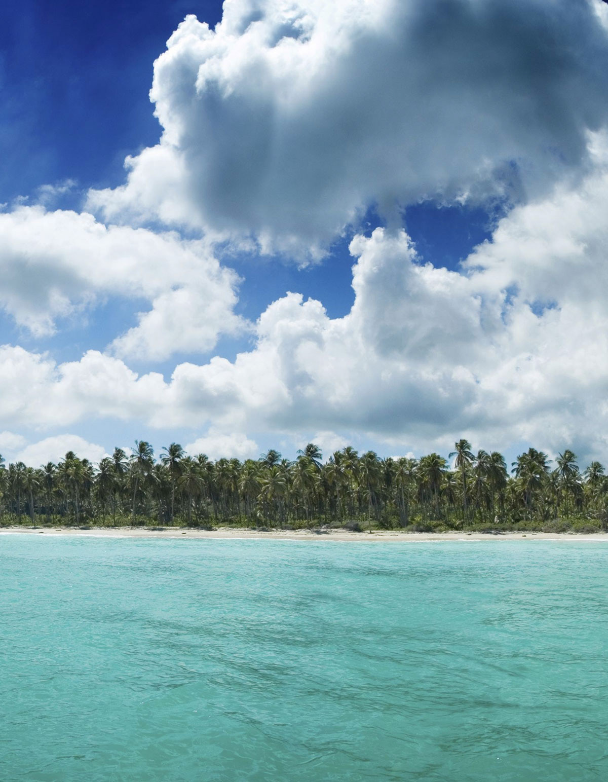
First Step of the procees was to find a picture with a nice tropical view that could suit properly as background for the future elements that would build the main idea and focus point of the artwork.
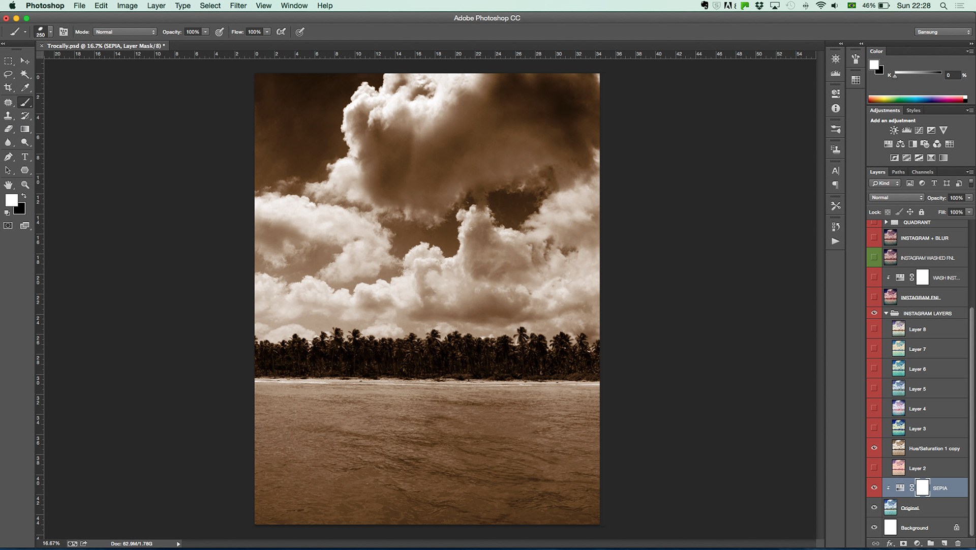
Second step was color correction. Using photoshop tools, the idea was to bring a more sepia tone to the image, to make sure other elements would stand out.
You can see in the layers at the right hand side, severel options were tested.
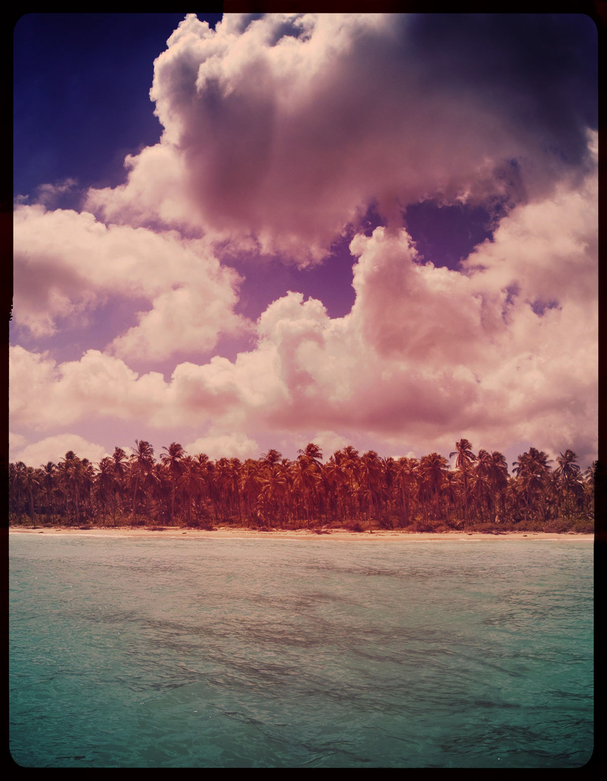
Final image after color correction. A vignette was added and a very settle radial blur. On top we brought some colder colors because the style was developed for a winter season.
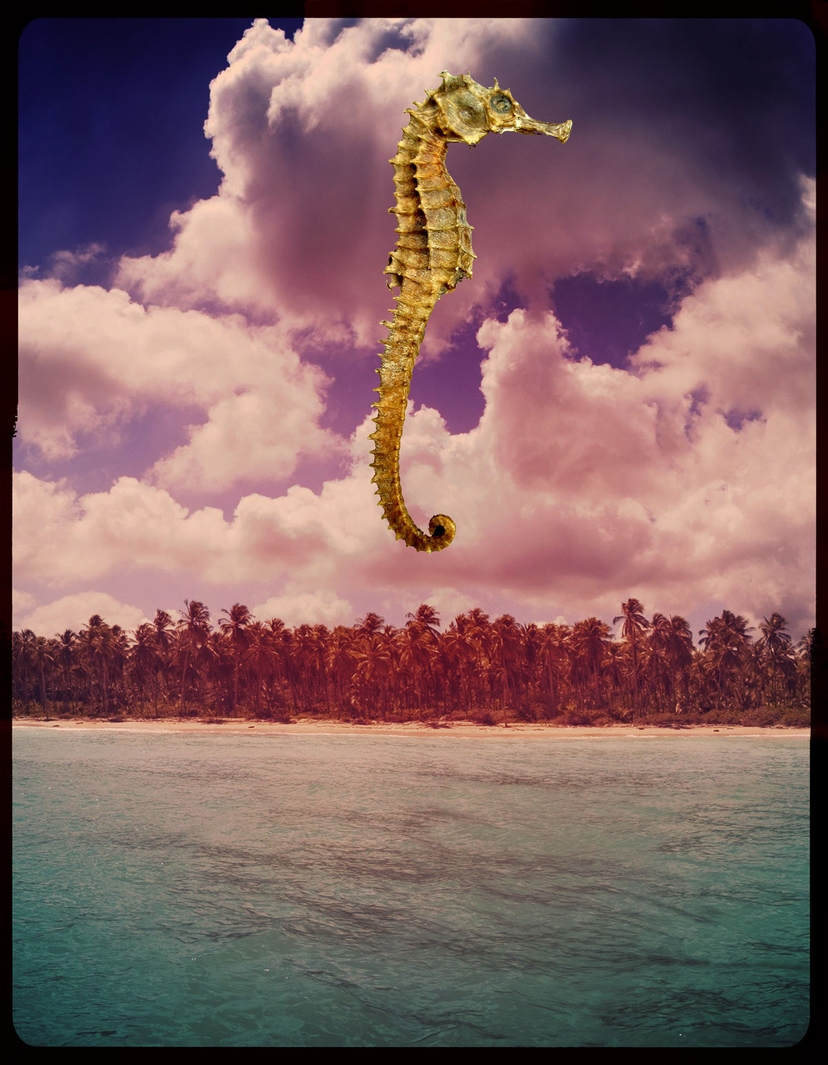
The next step was to add the main element... A seahorse in a nice yellow color and realistic structure brings depth to the piece.
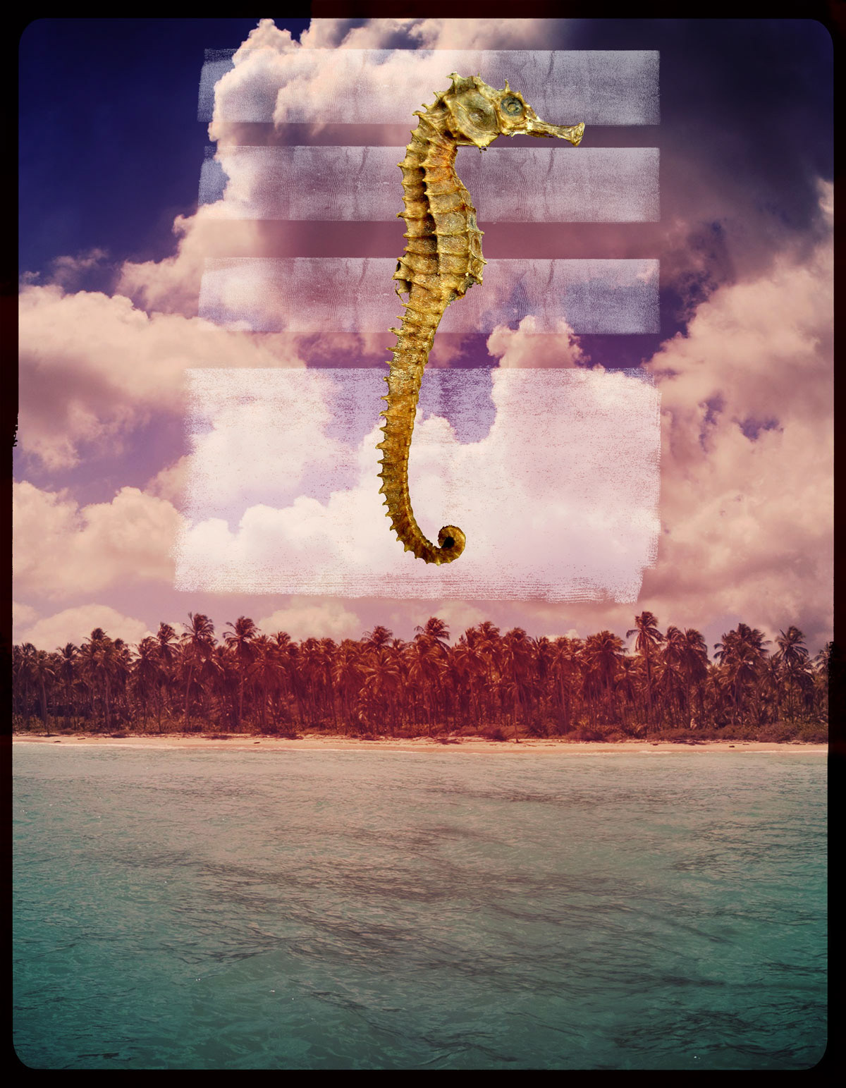
Something was still missing in between the main focus and background. An interference maybe. Watercolor strokes were added behind the seahorse to help blending the piece together and create a combination with the typography planed to be placed in the next step.
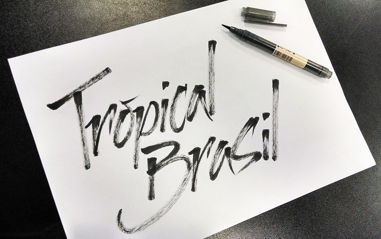
The branding: "Tropical Brasil" was developed using a brushpen.
We scanned the final typography at 300dpi and placed it into the artwork directly at Photoshop to make sure we would not miss the details and texture of the strokes.
We scanned the final typography at 300dpi and placed it into the artwork directly at Photoshop to make sure we would not miss the details and texture of the strokes.
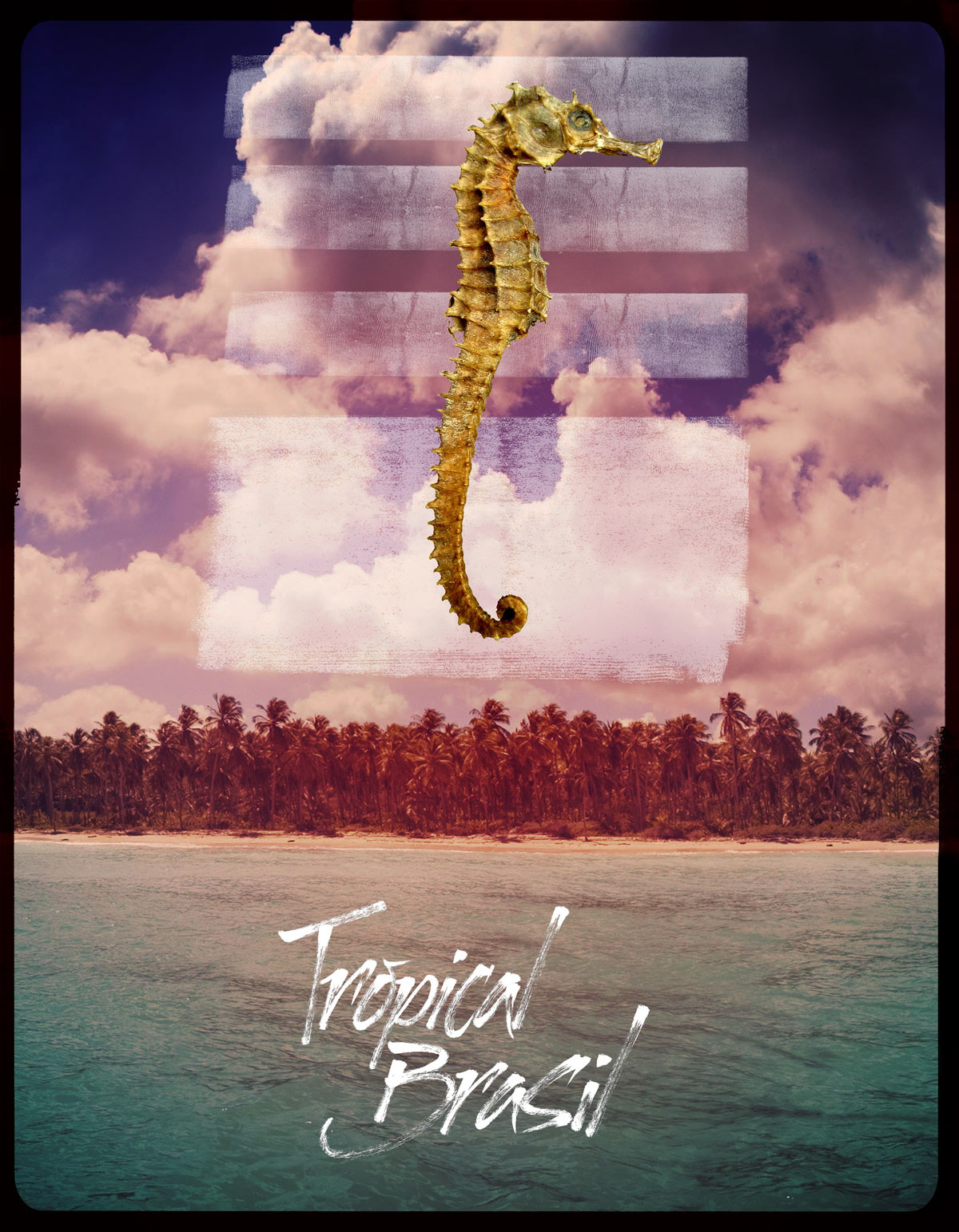
This the final result digitally, including all the elements, color correction, photo manipulation and caligraphy typing.
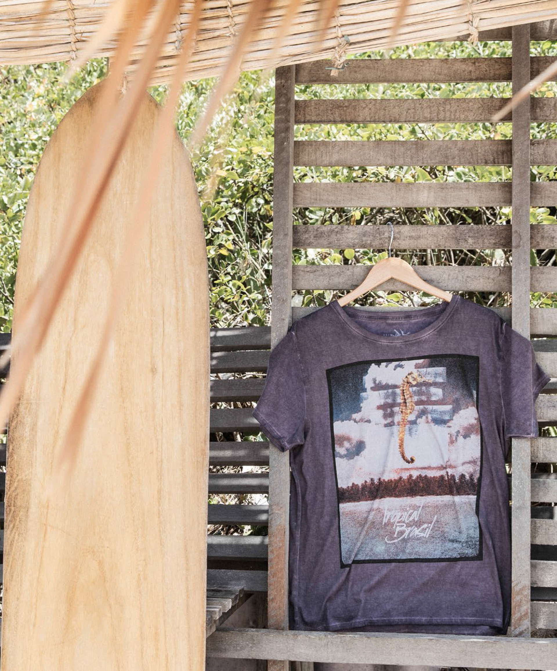
We used a soft plastisol ink for the silkscreen, but the print was applyed before the garment was washed. Thus, after washed we could achieve a very nice soft handfeel and a cool vintage look.
The t-shirt was developed in a 100% Pimma Cotton from Peru using a dirty washing technic.
This is the final garment being merchandised at the Tropical Brasil Winter 15 lookbook.
This is the final garment being merchandised at the Tropical Brasil Winter 15 lookbook.

Denis Romanello / Carlos Siqueira